EDA Case Study: Baltimore Police Department Arrest data

Introduction
Data Scientists spend quite a lot of time cleaning and exploring data before creating predictive models, and it’s often the exploratory data analysis step that proves to be the most fruitful part of the data science pipeline.
In this article, we’ll take a walk through the process of understanding data through exploratory data analysis, where we’ll use Python as a tool to uncover interesting statistics of a real-world dataset.
Exploratory Data Analysis
Exploratory Data Analysis (EDA) is essentially the term used to describe the main characteristics of a dataset, often done very visually with charts and graphs.
The idea of using EDA to find insights into data was developed by John Tukey in 1977, and is now the subject of a copious amount of books and online courses.
A huge benefit of EDA over classical methods is that humans are great at recognizing patterns visually, and thus provides a shortcut to finding a good model worth trying.
Various graphical techniques are used in EDA, but are often quite simple:
- Simple data plots like scatter plots, bar diagrams, histograms, bihistograms, probability plots, block plots.
- Statistical plots like mean plots, standard deviation plots, box plots, and main effects plots of the raw data, which help in understanding the distribution of data.
- Various distribution-related plots that help us see how populations and samples differ and relate
To show you how to use some of these tools, I’m going to use Python to perform the analysis.
Required libraries
If you don’t have Python on your computer, you can use the Anaconda Python distribution to install most of the Python packages you need. Anaconda provides a simple double-click installer for your convenience.
This notebook uses several Python packages that come standard with the Anaconda Python distribution. The primary libraries that we’ll be using are:
- pandas: Provides a DataFrame structure to store data in memory and work with it easily and efficiently.
- matplotlib: Basic plotting library in Python; most other Python plotting libraries are built on top of it.
A Case Study
Data Source:
Let’s perform some EDA on real world data. The data we will consider is Baltimore Police Department Arrest data. The data is hosted on: Data set Source Baltimore Police Depratment’s website: Baltimore Police Department . Data consists of around 1,31,000 arrests made by the Baltimore Police Department.
This data represents the top arrest charge of those processed at Baltimore’s Central Booking & Intake Facility. This data does not contain those who have been processed through Juvenile Booking. The data set was originally created on October 18, 2011. The data set was last updated on November 18, 2016. It is updated on a monthly basis.
*Metadata: *
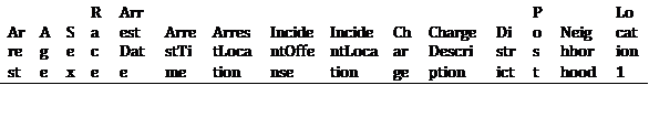
- Arrest-ID
- Age
- Sex
- Race
- ArrestDate
- ArrestTime
- ArrestLocation
- IncidentOffense
- IncidentLocation
- Charge
- ChargeDescription
- District
- Post
- Neighborhood
- Location1(Location Coordinates)
* Let’s start by importing some libraries: *
import pandas as pd
import matplotlib.pyplot as plt
import numpy as np
plt.style.use(‘ggplot’)
%matplotlib inline
pd.options.display.max_rows = 100
pd.options.display.max_columns = 100
* First we will load the data and understand its dimension *
# reading the data from the csv file
data_BPD = pd.read_csv(‘./data/BPD_Arrests.csv’)
data_BPD
**We are not loading the tables with the above dimensions as it will become huge, if you are interested, please connect with us on info@fusionanalyticsworld.com, we will share with you the tables separately
145654 rows × 15 columns
print(data_BPD.shape) # Get the shape of the data
(145654, 15)
So the data have * 145654 * observations and * 15 * variables.
Let’s have a sneak peek of data before we start our analysis:
data_BPD.describe(include=’all’) #Generates descriptive statistics
**Not loading the data here, you can contact separately
# Let’s see how many missing values we have in each variable
for column in data_BPD.columns:
print(column, data_BPD[column].isnull().sum())
Arrest 7687
Age 28
Sex 0
Race 0
ArrestDate 0
ArrestTime 0
ArrestLocation 59294
IncidentOffense 0
IncidentLocation 60594
Charge 17995
ChargeDescription 502
District 59323
Post 59342
Neighborhood 59324
Location 1 59250
We have NA values and missing labels in some variables. This is quite intuitive in real world data. We have to prepare our data taking care of all hindrances.
* Lets’ understand the Age distribution: *
plt.figure(figsize = (12,8)) # set the figure size
plt.xlabel(‘Age’, fontsize=18) # set the label of the x axis
plt.ylabel(‘Count’, fontsize=18) # set the label of the y axis
data_BPD[‘Age’].hist(bins = 50, color= ‘#2E2E2E’) # plotting
<matplotlib.axes._subplots.AxesSubplot at 0x7fc9318b88d0>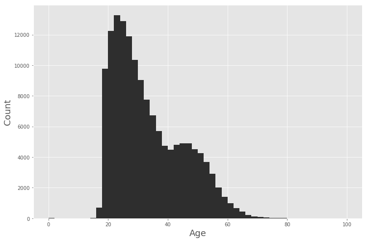
As we see most of arrests are in the age group of * 20 -27. *
A cursory view of gender (Sex) distribution reveals the following:
plt.figure(figsize = (12,8))
plt.ylabel(‘Sex’, fontsize=18)
plt.ylabel(‘count’, fontsize=18)
data_BPD[‘Sex’].value_counts().plot.bar(stacked=True, color=’#2A0A29′)
<matplotlib.axes._subplots.AxesSubplot at 0x7fc931155518>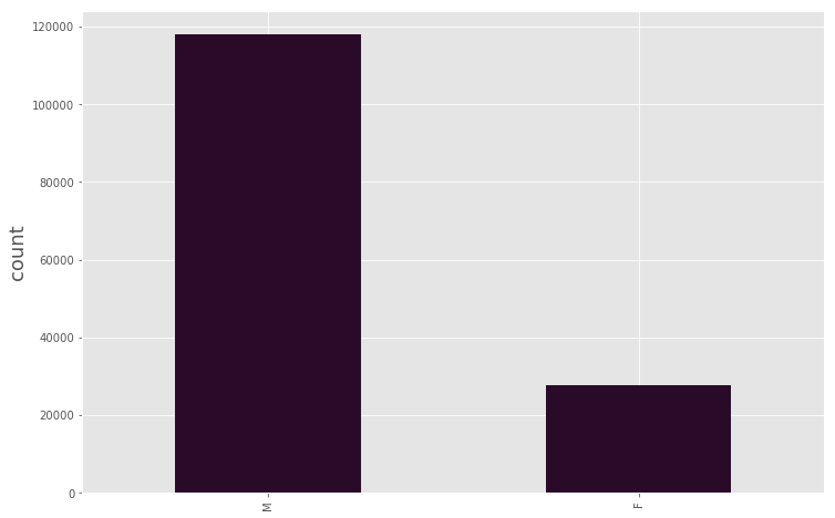
So the number of arrests is dominated by * male *.
* Let’s see how the race is distributed: *
plt.figure(figsize = (12,8))
plt.xlabel(‘Race’, fontsize=18)
plt.ylabel(‘count’, fontsize=18)
data_BPD[‘Race’].value_counts().plot.bar(stacked=True, color=’#071418′)
<matplotlib.axes._subplots.AxesSubplot at 0x7fc93103c208>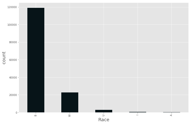
So, we see from data people from B Race group are mostly arrested by police.
We have variables recording the * Arrest Date * and * Arrest Time *. We can use these variables to reveal some interesting patterns.
#First let’s convert our ArrestDate and ArrestTime columns to pandas.datetime type:
data_BPD[‘ArrestDate’] = pd.to_datetime(data_BPD[‘ArrestDate’], format=’%m/%d/%Y’)
# Some of the observations have hh.mm format so we adjust them to have the same format as the other observations hh:mm
data_BPD[‘ArrestTime’] = data_BPD[‘ArrestTime’].map(lambda s: s.replace(‘.’, ‘:’))
data_BPD[‘ArrestTime’] = pd.to_datetime(data_BPD[‘ArrestTime’], format=’%H:%M’)
plt.figure(figsize = (12,8))
(data_BPD[‘ArrestDate’]
.groupby(data_BPD.ArrestDate.dt.weekday_name) # first we group our data by the day of the week
.agg(‘count’) # We then compute the number of observation we have in each group
.plot.bar(stacked=True, color=’#0A2A0A’) # Plotting
)
plt.xlabel(‘Weekday of arrest’, fontsize=18)
plt.ylabel(‘count’, fontsize=18)
<matplotlib.text.Text at 0x7fc92e6bcfd0>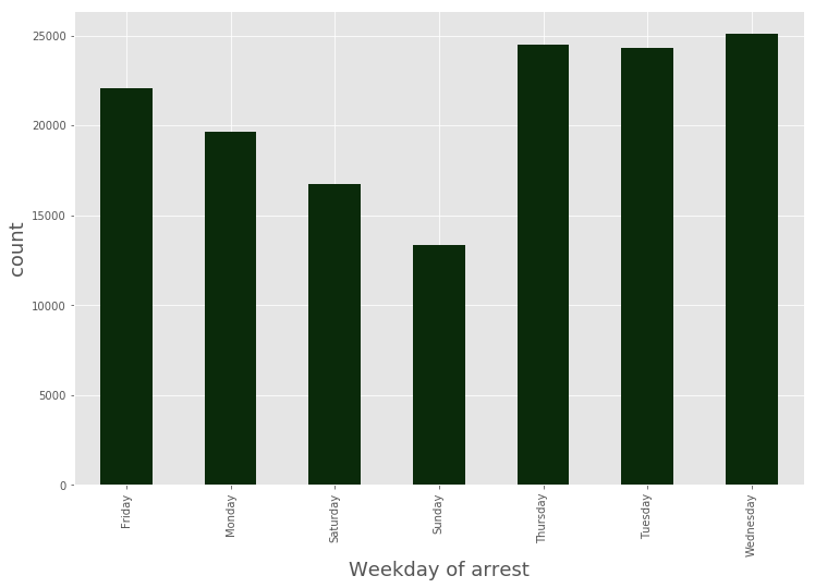
We can see that * weekends * have fewer number of arrests.
plt.figure(figsize = (12,8))
(data_BPD[‘ArrestDate’]
.groupby(data_BPD.ArrestDate.dt.month)
.agg(‘count’)
.plot.bar(stacked=True, color=’#0A2229′)
)
plt.xlabel(‘Month of arrest’, fontsize=18)
plt.ylabel(‘count’, fontsize=18)
<matplotlib.text.Text at 0x7fc931d47470>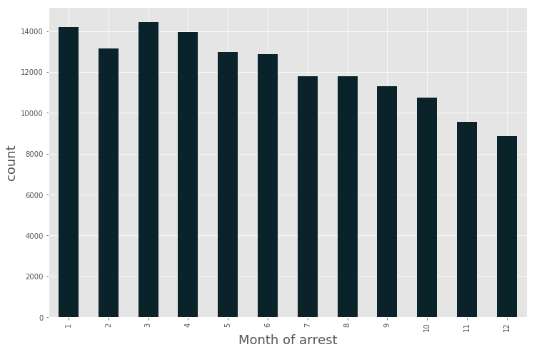
plt.figure(figsize = (12,8))
(data_BPD[‘ArrestDate’]
.groupby(data_BPD.ArrestDate.dt.year)
.agg(‘count’)
.plot.bar(stacked=True, color=’#220A29′)
)
plt.xlabel(‘Year of arrest’, fontsize=18)
plt.ylabel(‘count’, fontsize=18)
<matplotlib.text.Text at 0x7fc930b4b7b8>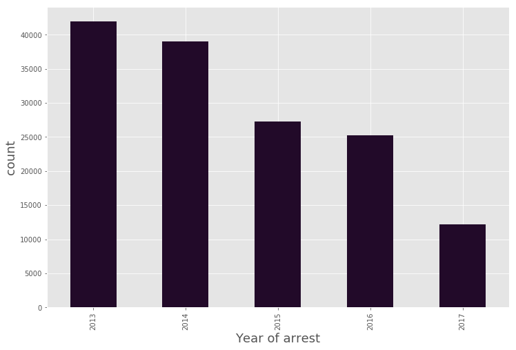
Number of people arrested also show a * declining trend* year-on-year (2013-2017).
plt.figure(figsize = (12,8))
(data_BPD[‘ArrestDate’]
.groupby(data_BPD.ArrestTime.dt.hour)
.agg(‘count’)
.plot.bar(stacked=True, color=’#610B0B’)
)
plt.xlabel(‘Hour of arrest’, fontsize=18)
plt.ylabel(‘count’, fontsize=18)
<matplotlib.text.Text at 0x7fc930afb748>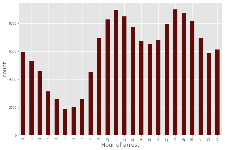
Now, we can see when most of the arrests occur in the * day*. There are fewer arrests in early morning.
Top 15 arrest locations are the following:
data_BPD[‘ArrestLocation’].value_counts()[:15].to_frame(‘Number of arrests’)
| Number of arrests | |
| 200 N EUTAW ST | 465 |
| 1500 RUSSELL ST | 365 |
| 1600 W NORTH AVE | 353 |
| 400 E LEXINGTON ST | 297 |
| 300 N EUTAW ST | 251 |
| 400 E BALTIMORE ST | 244 |
| 400 W SARATOGA ST | 232 |
| 600 LAURENS ST | 230 |
| 2400 FREDERICK AVE | 218 |
| 5100 REISTERSTOWN RD | 213 |
| 1500 W NORTH AVE | 210 |
| 1800 PENNSYLVANIA AVE | 204 |
| 5100 PARK HEIGHTS AVE | 197 |
| 1800 W PRATT ST | 167 |
| 600 CHERRY HILL RD | 159 |
* Top 15 Incident Offense are the following:*
import re
# We remove symbols from IncidentOffense column and convert it to lowercase
data_BPD[‘IncidentOffense’] = data_BPD[‘IncidentOffense’].map(lambda s : re.sub(‘[^\w]’,”, s).lower())
data_BPD[‘IncidentOffense’].value_counts()[:15].to_frame(‘Number of incidents’)
| Number of incidents | |
| unknownoffense | 96661 |
| 87narcotics | 12391 |
| 4ecommonassault | 7923 |
| 87onarcoticsoutside | 2617 |
| 6clarcenyshoplifting | 2444 |
| 79other | 2046 |
| 4caggassltoth | 1894 |
| 4baggassltcut | 1633 |
| 24towedvehicle | 1633 |
| 97searchseizure | 1547 |
| 5aburgresforce | 1045 |
| 55disorderlyperson | 826 |
| 4daggasslthand | 787 |
| 75destructofproperty | 734 |
| 7astolenauto | 705 |
* Top 15 Incident Locations are the following:*
data_BPD[‘IncidentLocation’].value_counts()[:15].to_frame(‘Number of incidents’)
| Number of incidents | |
| 200 N Eutaw St | 473 |
| 400 W Lexington St | 240 |
| 300 N Eutaw St | 235 |
| 1500 Russell St | 222 |
| 400 E Baltimore St | 221 |
| 1600 W North Av | 200 |
| 400 W Saratoga St | 197 |
| 600 Laurens St | 175 |
| 600 Cherry Hill Rd | 151 |
| 1200 W Pratt St | 143 |
| 1800 W Pratt St | 142 |
| 600 E Fayette St | 135 |
| 3800 E Lombard St | 129 |
| 200 N Conkling St | 128 |
| 5100 Park Heights Av | 127 |
* Top 15 charges: *
data_BPD[‘ChargeDescription’].value_counts()[:15].to_frame(‘Number of arrests’)
| Number of arrests | |
| Failure To Appear || Failure To Appear | 15373 |
| Unknown Charge | 8508 |
| Asslt-Sec Degree || Assault-Sec Degree | 7769 |
| Cds:Possess-Not Marihuana || Cds Violation | 5873 |
| Cds:Possess-Not Marihuana || Cds | 3760 |
| FAILURE TO APPEAR | 3195 |
| Violation Of Probation || Violation Of Probation | 3041 |
| Asslt-Sec Degree || Common Assault | 2805 |
| ASSAULT-SEC DEGREE | 2036 |
| Cds: Poss Marihuana L/T 10 G || Cds Violation | 1633 |
| Asslt-Sec Degree || Assault | 1486 |
| Prostitution-General || Prostitution | 1431 |
| CDS | 1422 |
| Detain Only | 1413 |
| Asslt-First Degree || Assault-First Degree | 1351 |
* Lets’ view the distribution of people arrested across different districts: *
plt.figure(figsize = (12,8))
data_BPD[‘District’].value_counts().plot.bar(stacked=True, color=’#2A0A29′)
plt.xlabel(‘District’, fontsize=18)
plt.ylabel(‘count’, fontsize=18)
plt.title(‘District Distribution’, fontsize=20)
<matplotlib.text.Text at 0x7fc930071908>
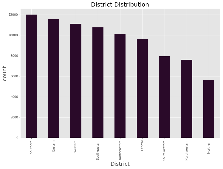
Comparatively, * Southern district * has more number of arrests.
Distribution of Arrest Year & Arrest month
data_BPD[‘year’] = data_BPD[‘ArrestDate’].dt.year
data_BPD[‘month’] = data_BPD[‘ArrestDate’].dt.month
(data_BPD.pivot_table(‘Arrest’, index=’year’, columns=’month’, aggfunc = ‘count’, fill_value=0)
.plot(kind=’bar’,stacked=True, figsize=(18,10))
)
plt.xlabel(‘Year’, fontsize=18)
plt.ylabel(‘count’, fontsize=18)
plt.title(‘Distribution of Arrest Year and Arrest month’, fontsize = 22)
<matplotlib.text.Text at 0x7fc92ff46278>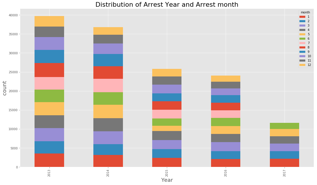
hour_period_map = {
0 : ‘0-3’,
1 : ‘0-3’,
2 : ‘0-3’,
3 : ‘0-3’,
4 : ‘4-7’,
5 : ‘4-7’,
6 : ‘4-7’,
7 : ‘4-7’,
8 : ‘8-11’,
9 : ‘8-11’,
10 : ‘8-11’,
11 : ‘8-11’,
12 : ’12-15′,
13 : ’12-15′,
14 : ’12-15′,
15 : ’12-15′,
16 : ’16-19′,
17 : ’16-19′,
18 : ’16-19′,
19 : ’16-19′,
20 : ’20-23′,
21 : ’20-23′,
22 : ’20-23′,
23 : ’20-23′,
}
data_BPD[‘period_in_day’] = data_BPD[‘ArrestTime’].map(lambda time : hour_period_map[time.hour])
data_BPD[‘weekday’] = data_BPD[‘ArrestDate’].dt.weekday_name
(data_BPD.pivot_table(‘Arrest’, index=’weekday’, columns=’period_in_day’, aggfunc = ‘count’, fill_value=0)
.plot(kind=’bar’,stacked=True, figsize=(18,10))
)
plt.xlabel(‘Day in the week’, fontsize=18)
plt.ylabel(‘count’, fontsize=18)
plt.title(‘Distribution of arrests Weekdays and Time’, fontsize = 22)
<matplotlib.text.Text at 0x7fc92e380d68>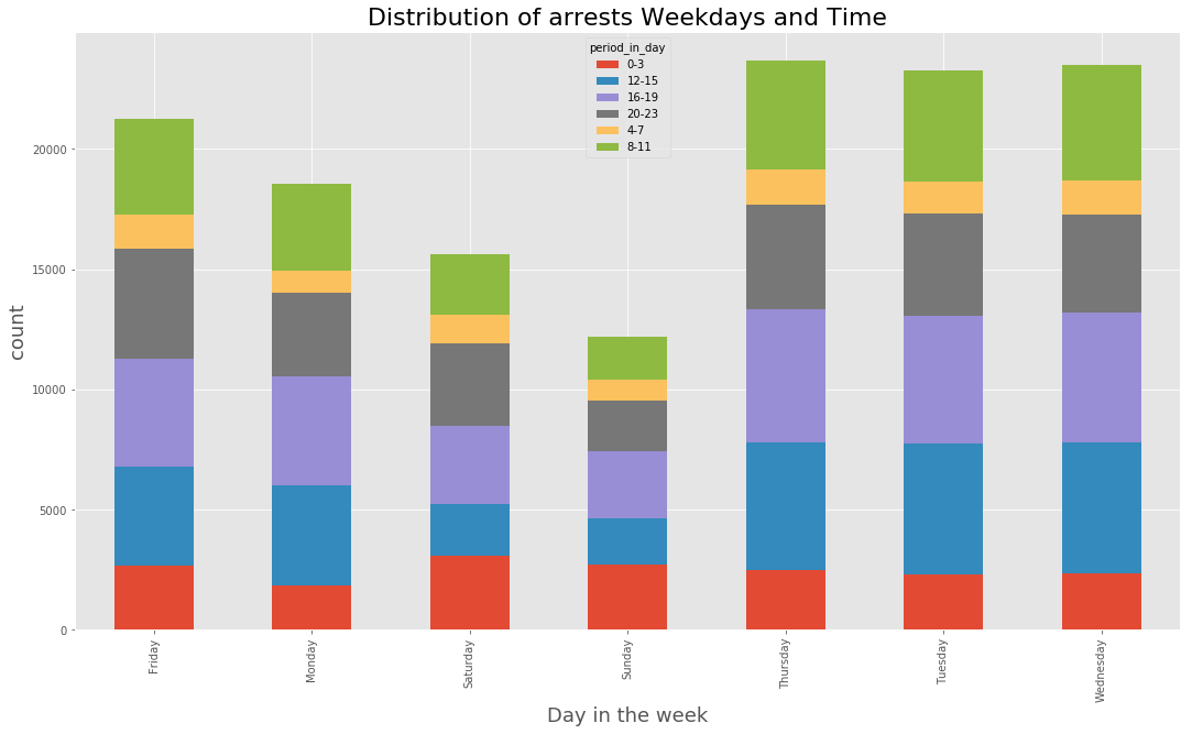
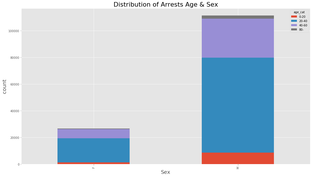
def age_cat_map(age):
if age < 20 :
return ‘0-20’
elif age < 40 :
return ’20-40′
elif age < 60 :
return ’40-60′
elif age < 60 :
return ’60-80′
else :
return ’80-‘
data_BPD[‘age_cat’] = data_BPD[‘Age’].map(age_cat_map)
(data_BPD.pivot_table(‘Arrest’, index=’Sex’, columns=’age_cat’, aggfunc = ‘count’, fill_value=0)
.plot(kind=’bar’,stacked=True, figsize=(18,10))
)
plt.title(‘Distribution of Arrests Age & Sex’, fontsize = 22)
plt.xlabel(‘Sex’, fontsize=18)
plt.ylabel(‘count’, fontsize=18)
<matplotlib.text.Text at 0x7fc92e24e6a0>
(data_BPD.pivot_table(‘Arrest’, index=’Race’, columns=’age_cat’, aggfunc = ‘count’, fill_value=0)
.plot(kind=’bar’,stacked=True, figsize=(18,10))
)
plt.xlabel(‘Race’, fontsize=18)
plt.ylabel(‘count’, fontsize=18)
plt.title(‘Distribution of Arrests Age & Race’, fontsize = 22)
<matplotlib.text.Text at 0x7fc92e192a58>
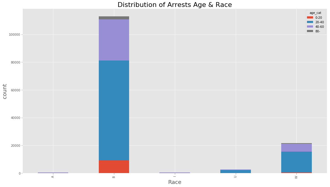
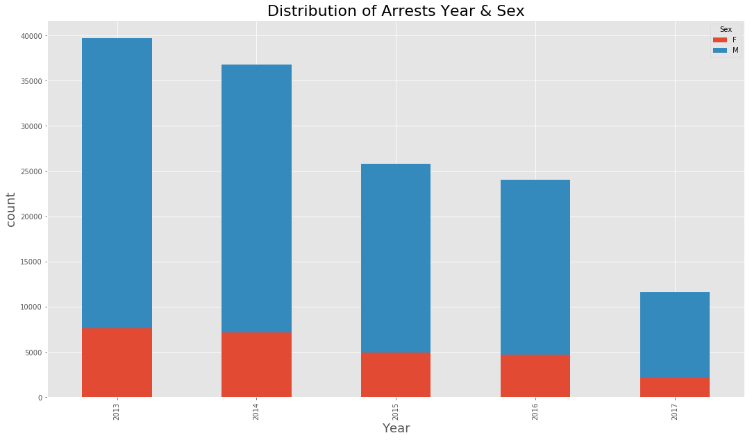
(data_BPD.pivot_table(‘Arrest’, index=’year’, columns=’Sex’, aggfunc = ‘count’, fill_value=0)
.plot(kind=’bar’,stacked=True, figsize=(18,10))
)
plt.title(‘Distribution of Arrests Year & Sex’, fontsize = 22)
plt.xlabel(‘Year’, fontsize=18)
plt.ylabel(‘count’, fontsize=18)
<matplotlib.text.Text at 0x7fc92e069668>
(data_BPD.pivot_table(‘Arrest’, index=’year’, columns=’Race’, aggfunc = ‘count’, fill_value=0)
.plot(kind=’bar’,stacked=True, figsize=(18,10))
)
plt.title(‘Distribution of Arrests Year & Race’, fontsize = 22)
plt.xlabel(‘Year’, fontsize=18)
plt.ylabel(‘count’, fontsize=18)
<matplotlib.text.Text at 0x7fc92dfb8748>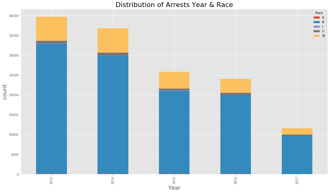
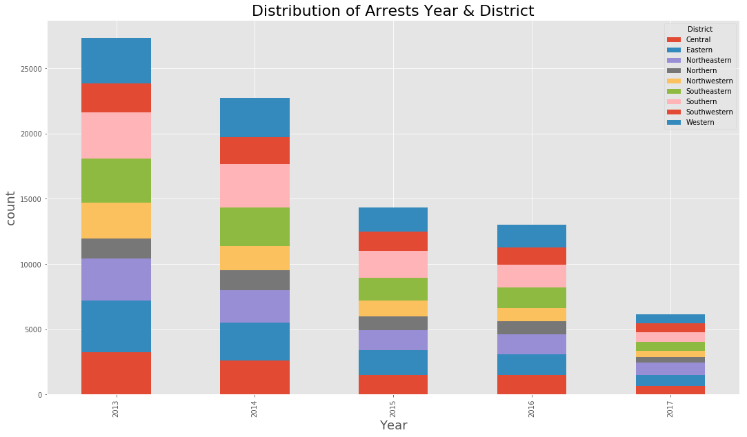
(data_BPD.pivot_table(‘Arrest’, index=’year’, columns=’District’, aggfunc = ‘count’, fill_value=0)
.plot(kind=’bar’,stacked=True, figsize=(18,10))
)
plt.title(‘Distribution of Arrests Year & District’, fontsize = 22)
plt.xlabel(‘Year’, fontsize=18)
plt.ylabel(‘count’, fontsize=18)
<matplotlib.text.Text at 0x7fc92de24278>
(data_BPD.pivot_table(‘Arrest’, index=’Age’, columns=’Race’, aggfunc = ‘count’, fill_value=0)
.plot(kind=’bar’, stacked = True, figsize=(18,10))
)
plt.title(‘Distribution of arrests age and race in a histogram’, fontsize = 22)
plt.xlabel(‘Age’, fontsize=18)
plt.ylabel(‘count’, fontsize=18)
<matplotlib.text.Text at 0x7fc92dcb7e10>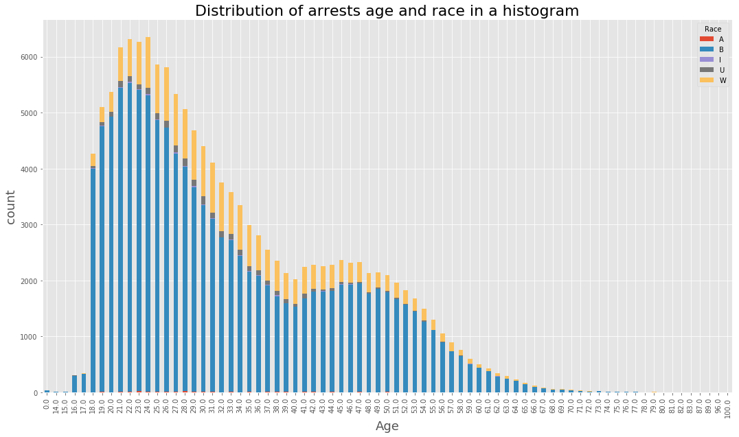
df = data_BPD.pivot_table(‘Arrest’, index=’Age’, columns=’Race’, aggfunc = ‘count’, fill_value=0)
plt.figure(figsize=(18,10))
plt.plot(df[‘A’])
plt.plot(df[‘B’])
plt.plot(df[‘U’])
plt.plot(df[‘I’])
plt.plot(df[‘W’])
plt.xlabel(‘Age’, fontsize=18)
plt.ylabel(‘count’, fontsize=18)
<matplotlib.text.Text at 0x7fc92d9d8dd8>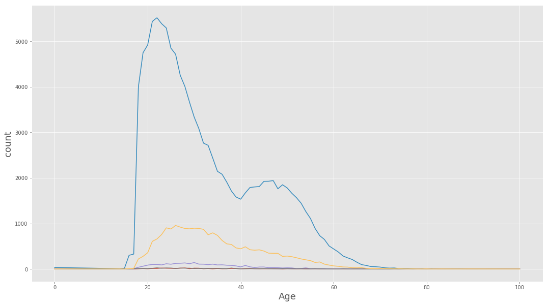
(data_BPD.pivot_table(‘Arrest’, index=’Age’, columns=’District’, aggfunc = ‘count’, fill_value=0)
.plot(kind=’bar’, stacked = True, figsize=(18,10))
)
plt.xlabel(‘Age’, fontsize=18)
plt.ylabel(‘count’, fontsize=18)
plt.title(‘Arrests across district and age’, fontsize = 22)
<matplotlib.text.Text at 0x7fc92d346320>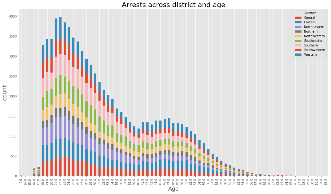
(data_BPD.pivot_table(‘Arrest’, index=’Age’, columns=’month’, aggfunc = ‘count’, fill_value=0)
.plot(kind=’bar’, stacked = True, figsize=(18,10))
)
plt.xlabel(‘Age’, fontsize=18)
plt.ylabel(‘count’, fontsize=18)
plt.title(‘Arrests Age Month’, fontsize = 22)
<matplotlib.text.Text at 0x7fc924ede518>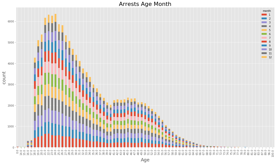
(data_BPD.pivot_table(‘Arrest’, index=’Age’, columns=’year’, aggfunc = ‘count’, fill_value=0)
.plot(kind=’bar’, stacked = True, figsize=(18,10))
)
plt.xlabel(‘Age’, fontsize=18)
plt.ylabel(‘count’, fontsize=18)
plt.title(‘Arrests Age Year’, fontsize = 22)
<matplotlib.text.Text at 0x7fc9242057b8>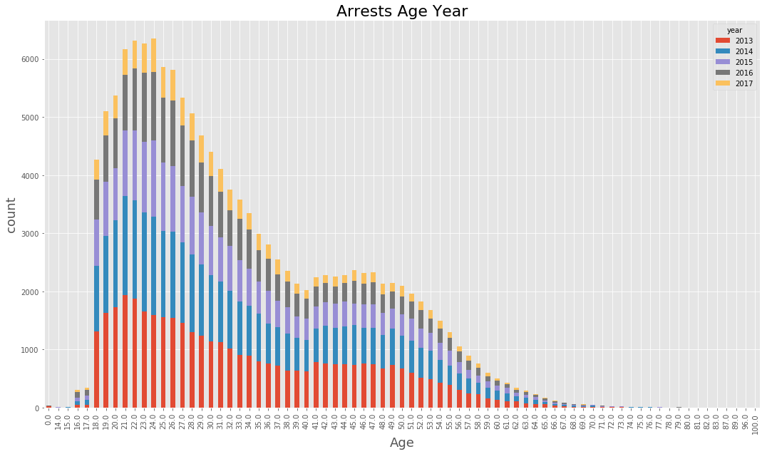
(data_BPD.pivot_table(‘Arrest’, index=’Age’, columns=’weekday’, aggfunc = ‘count’, fill_value=0)
.plot(kind=’bar’, stacked = True, figsize=(18,10))
)
plt.xlabel(‘Age’, fontsize=18)
plt.ylabel(‘count’, fontsize=18)
plt.title(‘Distribution of Arrests on age and Weekdays’, fontsize = 22)
<matplotlib.text.Text at 0x7fc91efe0908>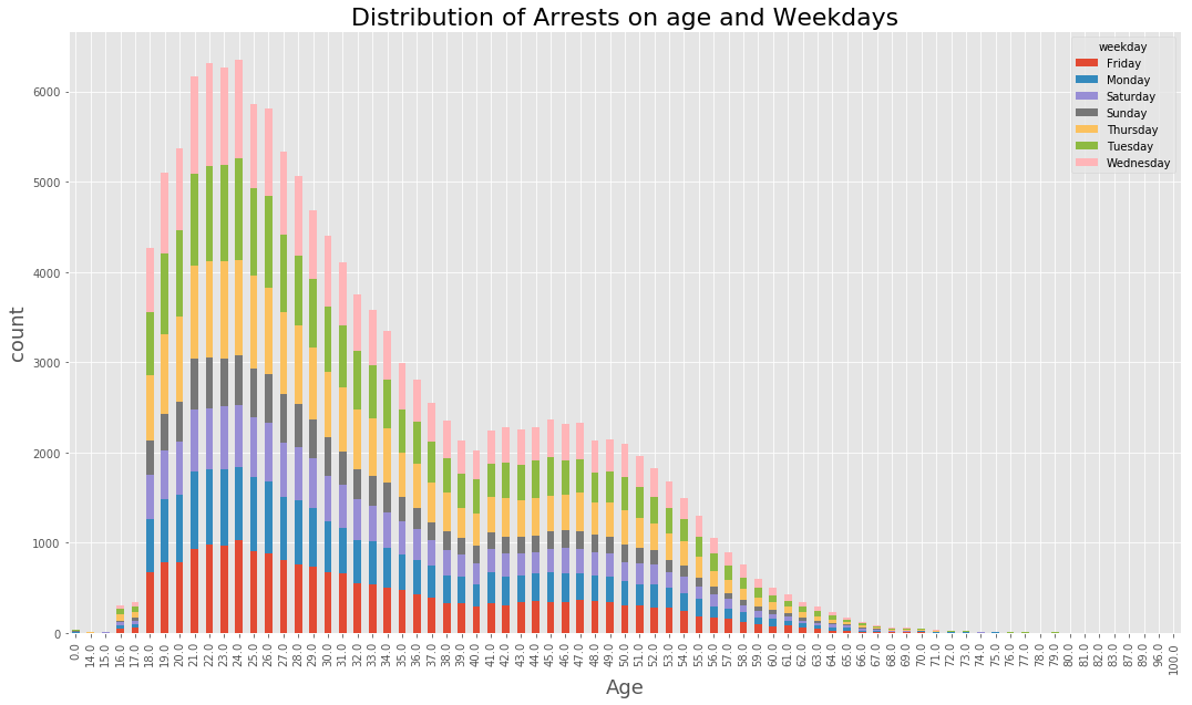
We have seen the distributions of number of arrests across various variables and the interactions among them.
End Notes:
We can appreciate the role of exploratory data analysis in understanding the patterns of data and preparation of hypothesis. These serve as building blocks for further analysis. We have seen various plots to understand the data. For better understanding we have analyzed a real world data set. Stakeholders may take few of the decisions on prevention of crime and deployment of personnel after having a glance on the plots. A resourceful analysis can help taking complex decisions. We can use Predictive analytics and various optimization techniques for taking such decisions.
Author: Mohamed R., a Machine Learning and Signal Processing expert and part-time author at LearnDataSci
27 comments
Profile Status
ACTIVE
Profile Info


Kalyan Banga226 Posts
I am Kalyan Banga, a Post Graduate in Business Analytics from Indian Institute of Management (IIM) Calcutta, a premier management institute, ranked best B-School in Asia in FT Masters management global rankings. I have spent 14 years in field of Research & Analytics.


2 Comments
Freelance Data Scientist & Statistical Consultant: An Interview with Wesley Engers - Fusion Analytics World
August 1, 2017 at 1:52 am[…] I have worked for Symantec (Fortune 500) as an Associate Statistician doing data analytics in both statistical process control as well as marketing, pricing, and discounting […]
Arjun Sai
November 23, 2018 at 12:36 pmI am really admired for the great info is visible in this blog that to lot of benefits for visiting the nice info in this website.
Thanks a lot for using the nice info is visible in this blog.