Exploratory Data Analysis – A Case Study

Article By:
Santanu Dutta
Introduction
A Data Scientist must understand the data in hand. Before diving deep into the oceans’ of predictive analysis, he/she have to pause and look at the enormous mass of messy data points (unstructured and structured) through the looking glass of analytic powers, domain knowledge, subjective understanding, skepticism of existing assumptions – to find solutions to business challenges. Data Scientists often spend lot of time wrangling, massaging the data and building various hypothesis.
This time we will delve in one of the interesting approaches to understand the data – EDA and go through EDA of a real world data.
Exploratory Data Analysis
Exploratory Data Analysis (EDA) refers to a set of approaches to analyze datasets , to summarize their main characteristics, often with visual methods. It was originally developed by John Tukey to display data in such a way that interesting features will become apparent.
The seminal work in EDA is Exploratory Data Analysis, Tukey, (1977). Over the years it has benefitted from other noteworthy publications such as Data Analysis and Regression, Mosteller and Tukey (1977), Interactive Data Analysis, Hoaglin (1977), The ABC’s of EDA, Velleman and Hoaglin (1981) . It has gained a large following as “the” way to analyze a data set. Unlike classical methods which usually begin with an assumed model for the data, EDA techniques are used to excavate the data to suggest models that might be appropriate.
Various graphical techniques are generally used in EDA. But they are often quite simple, consisting of various techniques of:
- Simple data plots like scatter plots, data traces, bar diagrams, histograms, bihistograms, probability plots, lag plots, block plots, and Youden plots.
- Statistical plots like mean plots, standard deviation plots, box plots, and main effects plots of the raw data. It help in understanding distribution of data.
- We can understand the outliers, viewing distribution through various plots. Often we can compare by placing various plots relating to sample from different populations.
A Case Study
Data Source:
Lets perform some EDA on real world data. The data we will consider is Baltimore Police Department Arrest data. The data is hosted on: Data set Source Baltimore Police Depratment’s website: Baltimore Police Department . Data consists of around 1,31,000 arrests made by the Baltimore Police Department.
This data represents the top arrest charge of those processed at Baltimore’s Central Booking & Intake Facility. This data does not contain those who have been processed through Juvenile Booking. The data set was originally created on October 18, 2011. The data set was last updated on November 18, 2016. It is updated on a monthly basis.
Metadata
- Arrest-ID
- Age
- Sex
- Race
- ArrestDate
- ArrestTime
- ArrestLocation
- IncidentOffense
- IncidentLocation
- Charge
- ChargeDescription
- District
- Post
- Neighborhood
- Location1(Location Coordinates)
We will go through the analysis tool agnostic. However, open source tools like R / Python can be used for analysis.
First we will load the data and understand its dimension.
Data have 130713 observations and 15 variables.
Let’s have a sneak peek of data before we start our analysis.
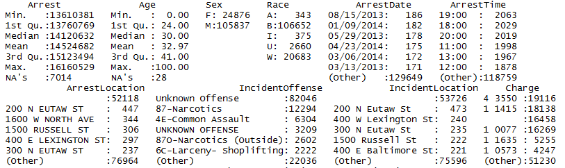
We have NA values and missing labels in some variables. This is quite intuitive in real world data. We have to prepare our data taking care of all hindrances.
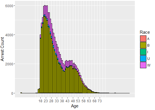
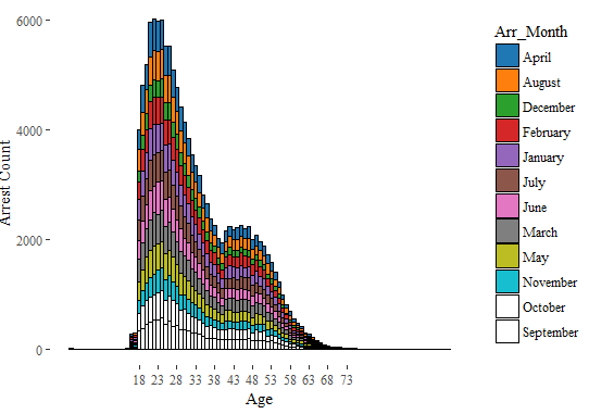
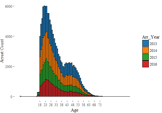
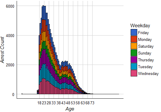
Lets’ understand the Age distribution.
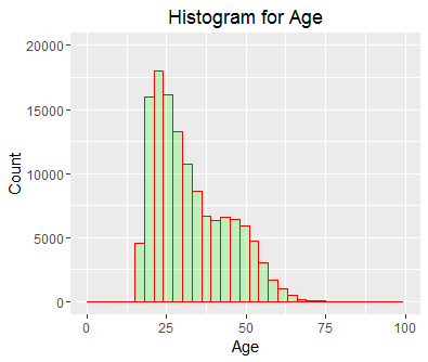
As we see most of arrests are in the age group of 20 -27.
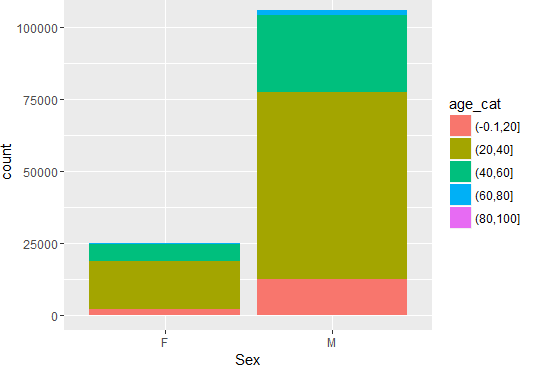
A cursory view of gender (Sex) distribution reveals the following:
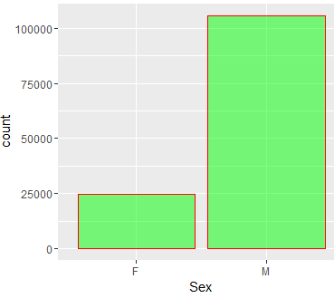
So, number of arrests is dominated by male.
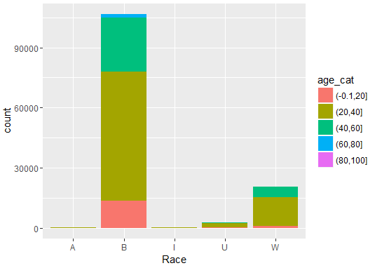
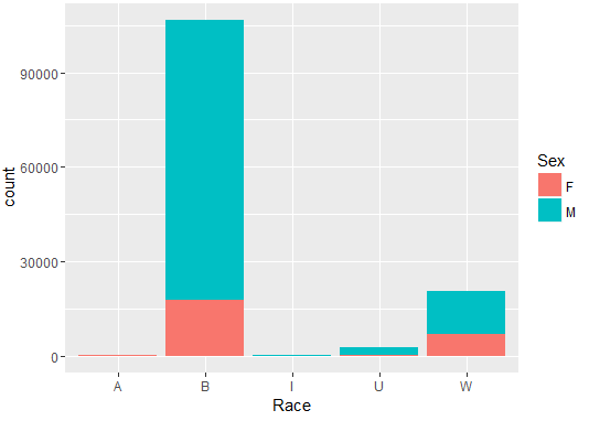
Race is distributed in the following way.
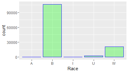
So, we see from data people from B Race group are mostly arrested by police.
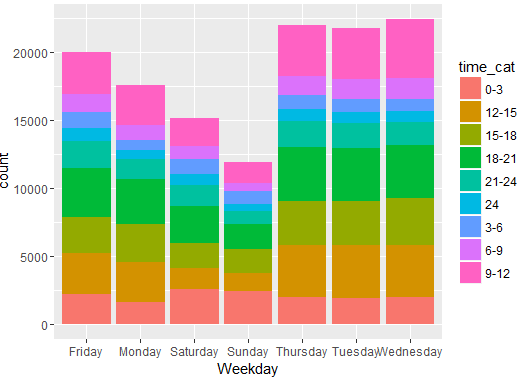
We have variables recording the Arrest Date and Arrest Time. We can use these variables to reveal some interesting patterns.
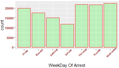
We can see that weekends have fewer number of arrests.
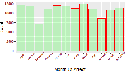
Arrest in different months have some interesting patterns. Can you hypothesize, the data pattern?
I will leave it as an exercise for you. Please do post your hypothesis in the comments below.
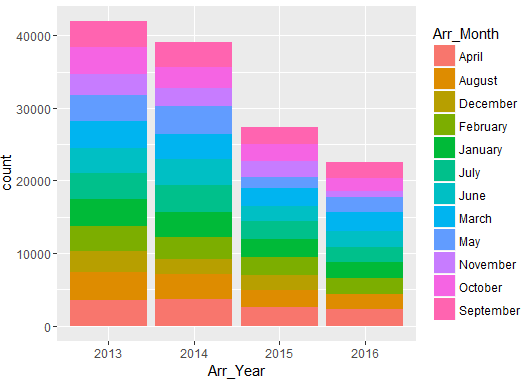
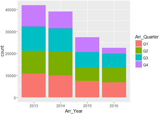
Distribution of data in various quarters are as follows:
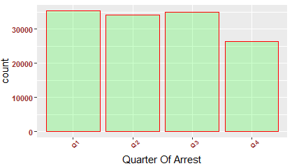
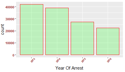
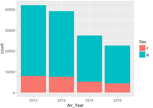
Number of people arrested show a declining trend year-on-year (2013-2016).
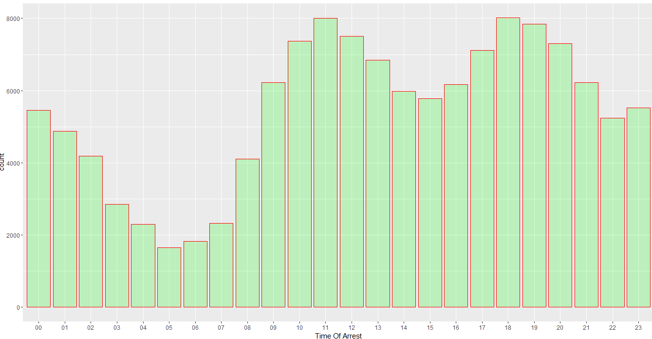
Now, we can see when most of the arrests occur in a day. There are fewer arrests in early morning.
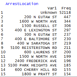
Top 15 arrest locations are following:
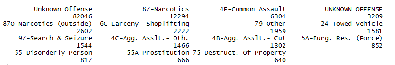
Top 15 Incident Offense:
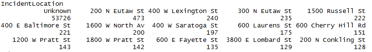
Top 15 Incident Location
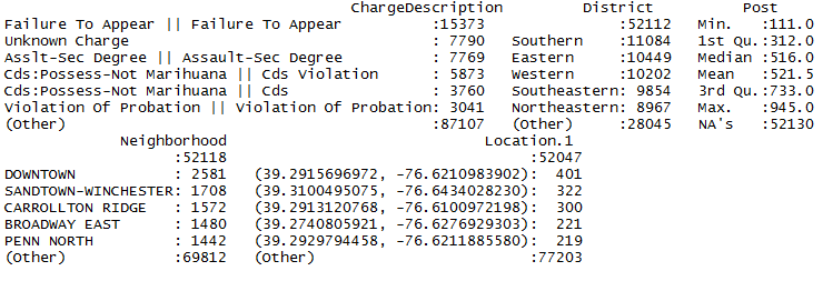
Top 15 charge

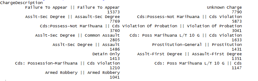
Top 15 Charge Description
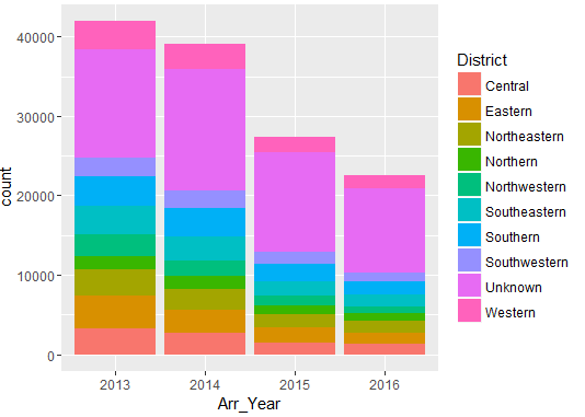
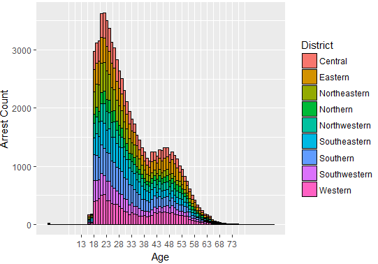
Lets’ view the distribution of people arrested across different districts.
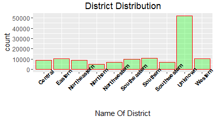
Comparatively, Southern district has more number of arrests.
Top 15 Posts
![]()
Distribution of Arrest Year & Arrest month

This is self-explanatory.
Distribution of arrests Weekdays & Time
Distribution of arrests Year & Quarter
Distribution of Arrests Age & Sex
Distribution of Arrests Age & Race
Distribution of Arrests Race & Sex
Distribution of Arrests Year & Sex
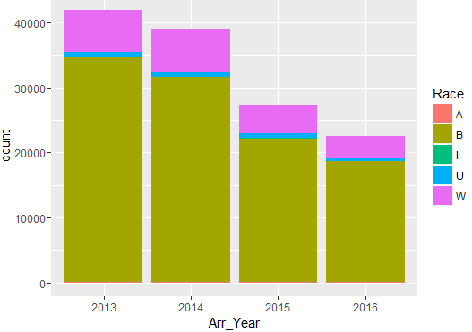
Distribution of Arrests Year & Race
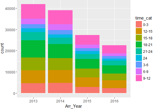
Distribution of Arrests Year & Time
Distribution of Arrests Year & District
Distribution of arrests age and race in a histogram
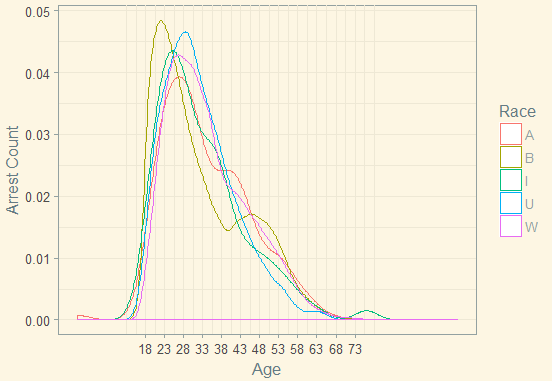
Density Plot:
Arrests across district and age
Arrests Age Month
Arrests Age Year
Distribution of Arrests on age and Weekdays
We have seen the distributions of number of arrests across various variables and the interactions among them.
But, if we want to brief stakeholders regarding the distribution of arrests across locations some visual geographic presentations serve the purpose. It give a clear picture.
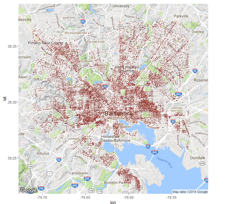
We can also present a picture regarding areas which are most susceptible to crimes and arrests.
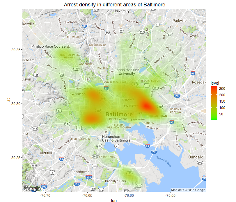
The red areas are where majority of arrests occurred and the number decrease down to green areas.
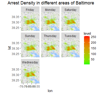
Lets’ view the concentrations of arrests across different weekdays in different locations.
End Notes:
We can appreciate the role of exploratory data analysis in understanding the patterns of data and preparation of hypothesis. These serve as building blocks for further analysis. We have seen various plots to understand the data. For better understanding we have analyzed a real world data set. Stakeholders may take few of the decisions on prevention of crime and deployment of personnel after having a glance on the plots. A resourceful analysis can help taking complex decisions. We can use Predictive analytics and various optimization techniques for taking such decisions.
Author: Santanu Dutta
Profile: Santanu is a Data Science evangelist. An analytics professional with more than 6 years of successful career in Banking, Insurance, Retail. He is Post Graduate in Management, Chartered Associate in Banking ( CAIIB ), NCFM , AMFI certified. He is interested in machine learning problems involving the integration of multiple learning strategies, investigations into implicit and explicit learning, and modelling novelty solutions to computer science and real life problems.


shan2 Posts
✔ I am a Data Science Evangelist. ✔ Post Grad in Management ✔Chartered Associate in Banking ( CAIIB ), NCFM , AMFI qualified. I enjoy applying machine learning techniques to applications involving such issues as feature extraction, statistical data analysis, information retrieval, predictive modelling, data mining and adaptive user modelling.


5 Comments
Aditya
December 1, 2016 at 7:55 pmBeautiful explanation.. a beautiful way of thinking. Hat’s off.
Kalyan Banga
December 2, 2016 at 1:23 amGlad to hear Aditya that you liked the article. Keep visiting our website for more 🙂
ayisha
February 13, 2017 at 2:59 pmplease can i get the commands for every explanation
Kalyan Banga
July 26, 2017 at 1:07 amThank you for your interest Ayisha, i somehow missed your comment. Dropped you an email to understand what exactly you are looking at, will send you the information accordingly
Shan
November 23, 2017 at 6:27 pmCan you please explain a bit which command you are asking about .. Thanks