HR Analytics: Understanding & Controlling Employee Attrition using Predictive Modeling
 By: Vikash Singh
Introduction
Employee Attrition is a challege for most of the organizations. More often than not, it’s a chellenge identifying variables or factors which may increase the probability of attrition as many of these are qualitative in nature. Even if one identifies these triggers, its difficult to quantify them and create a High- Medium – Low Risk Profile of the candidates. This is where Predictive Modeling can be of great help, and that is what is covered in the article.
Data
The dataset consists of 1470 observations of 15 variables which are described below:
- Attrition: Whether the attrition happened (Yes=1) or not (No=0). This is our independent variable which we are trying to score.
- Age
- BusinessTravel: relates to travel frequency of the employee
- Satisfaction_level: relates to environment satisfaction level of the employee (1-Low, 2-Medium, 3-High, 4-Very high)
- Sex – gender of the employee
- JobInvolvement: relates to job involvement level of the employee (1-Low, 2-Medium, 3-High, 4-Very high)
- JobSatisfaction: relates to job satisfaction level of the employee (1-Low, 2-Medium, 3-High, 4-Very high)
- MaritalStatus
- MonthlyIncome
- NumCompaniesWorked: how many companies has the employee worked upon
- OverTime: whether the employee works overtime (Yes / No)
- TrainingTimesLastYear: number of trainings received by the employee last year
- YearsInCurrentRole: number of years in current role
- YearsSinceLastPromotion: number of years since last promotion
- YearsWithCurrManager: number of years with current manager
Loading the Data
Data Exploration
1) Structure of the Data
str(attrition)
## ‘data.frame’: 1470 obs. of 15 variables:
## $ Age : int 40 48 36 32 26 31 58 29 37 35 …
## $ Attrition : int 1 0 1 0 0 0 0 0 0 0 …
## $ BusinessTravel : Factor w/ 3 levels “Non-Travel”,”Travel_Frequently”,..: 3 2 3 2 3 2 3 3 2 3 …
## $ Satisfaction_level : int 2 3 4 4 1 4 3 4 4 3 …
## $ Sex : Factor w/ 2 levels “Female”,”Male”: 1 2 2 1 2 2 1 2 2 2 …
## $ JobInvolvement : int 3 2 2 3 3 3 4 3 2 3 …
## $ JobSatisfaction : int 4 2 3 3 2 4 1 3 3 3 …
## $ MaritalStatus : Factor w/ 3 levels “Divorced”,”Married”,..: 3 2 3 2 2 3 2 1 3 2 …
## $ MonthlyIncome : int 5394 4617 1881 2618 3121 2761 2403 2424 8573 4713 …
## $ NumCompaniesWorked : int 8 1 6 1 9 0 4 1 0 6 …
## $ OverTime : Factor w/ 2 levels “No”,”Yes”: 2 1 2 2 1 1 2 1 1 1 …
## $ TrainingTimesLastYear : int 0 3 3 3 3 2 3 2 2 3 …
## $ YearsInCurrentRole : int 4 7 0 7 2 7 0 0 7 7 …
## $ YearsSinceLastPromotion : int 0 1 0 3 2 3 0 0 1 7 …
## $ YearsWithCurrManager : int 5 7 0 0 2 6 0 0 8 7 …
#Converting categorical variables as factors which are coded as numbers
attrition$Attrition = as.factor(attrition$Attrition)
attrition$Satisfaction_level = as.factor(attrition$Satisfaction_level)
attrition$JobInvolvement = as.factor(attrition$JobInvolvement)
attrition$JobSatisfaction = as.factor(attrition$JobSatisfaction)
2) Missing Values
table(is.na(attrition))
##
## FALSE
## 22050
There are no missing values in the data set.
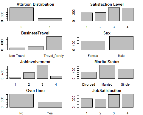
3) Visualisation of Independent Variables
For numerical variables, we will use histograms; whereas for Categorical Values, we will use Bar Charts or Frequency Counts.
Distribution of Categorical Variables
par(mfrow=c(4,2))
par(mar = rep(2, 4))
barplot(table(attrition$Attrition), main =“Attrition Distribution”)
barplot(table(attrition$Satisfaction_level), main =“Satisfaction Level”)
barplot(table(attrition$BusinessTravel), main =“BusinessTravel”)
barplot(table(attrition$Sex), main =“Sex”)
barplot(table(attrition$JobInvolvement), main =“JobInvolvement”)
barplot(table(attrition$MaritalStatus), main =“MaritalStatus”)
barplot(table(attrition$OverTime), main =“OverTime”)
barplot(table(attrition$JobSatisfaction), main =“JobSatisfaction”)
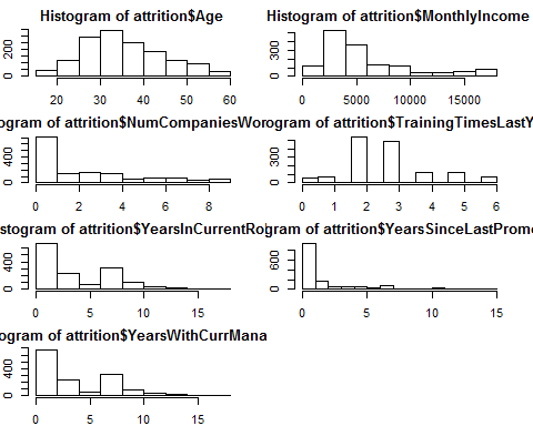
Distribution of Continuous Variables
par(mfrow=c(4,2))
par(mar = rep(2, 4))
hist(attrition$Age)
hist(attrition$MonthlyIncome)
hist(attrition$NumCompaniesWorked)
hist(attrition$TrainingTimesLastYear)
hist(attrition$YearsInCurrentRole)
hist(attrition$YearsSinceLastPromotion)
hist(attrition$YearsWithCurrManager)
Building Predictive Models
Baseline Accuracy
table(attrition$Attrition)
##
## 0 1
## 1233 237
237 out of total 1470 observations left the job. So the baseline accuracy is 1233/1470 = 84%, without building any model. But this naive way would classify all employee churned as non-churn, which defeats the purpose of creating a response plan to reduce employee attrition.
Let’s go ahead and build a model which is more ‘sensitive’ to our business requirement.
Dividing the dataset
Before doing any modeling, let’s divide our data set into training and testing data set to evaluate the performance of our model.
#Dividing the data set into train and test
library(caTools)
## Warning: package ‘caTools’ was built under R version 3.2.4
set.seed(200)
spl = sample.split(attrition$Attrition, SplitRatio = 0.70)
train = subset(attrition, spl == TRUE)
test = subset(attrition, spl == FALSE)
Logistic Regression
Build a logistic regression model using all of the independent variables to predict the dependent variable “Attrition”, and use the training set to build the model.
log = glm(Attrition ~ . , family=“binomial”, data = train)
summary(log)
##
## Call:
## glm(formula = Attrition ~ ., family = “binomial”, data = train)
##
## Deviance Residuals:
## Min 1Q Median 3Q Max
## -1.6850 -0.5645 -0.3447 -0.1810 3.5033
##
## Coefficients:
## Estimate Std. Error z value Pr(>|z|)
## (Intercept) 1.090e+00 7.381e-01 1.477 0.139604
## Age -3.866e-02 1.349e-02 -2.866 0.004153 **
## BusinessTravelTravel_Frequently 1.142e+00 4.241e-01 2.694 0.007059 **
## BusinessTravelTravel_Rarely 7.295e-01 3.908e-01 1.866 0.061973 .
## Satisfaction_level2 -8.338e-01 2.980e-01 -2.797 0.005151 **
## Satisfaction_level3 -9.093e-01 2.748e-01 -3.309 0.000936 ***
## Satisfaction_level4 -1.046e+00 2.741e-01 -3.815 0.000136 ***
## SexMale 2.936e-01 2.009e-01 1.462 0.143859
## JobInvolvement2 -1.131e+00 3.872e-01 -2.922 0.003479 **
## JobInvolvement3 -1.230e+00 3.611e-01 -3.406 0.000658 ***
## JobInvolvement4 -1.817e+00 5.048e-01 -3.599 0.000319 ***
## JobSatisfaction2 -3.894e-01 2.865e-01 -1.359 0.174200
## JobSatisfaction3 -5.039e-01 2.543e-01 -1.982 0.047528 *
## JobSatisfaction4 -1.213e+00 2.833e-01 -4.283 1.85e-05 ***
## MaritalStatusMarried 3.027e-01 2.819e-01 1.074 0.282906
## MaritalStatusSingle 1.248e+00 2.794e-01 4.467 7.92e-06 ***
## MonthlyIncome -1.057e-04 3.583e-05 -2.950 0.003173 **
## NumCompaniesWorked 9.840e-02 4.238e-02 2.322 0.020236 *
## OverTimeYes 1.488e+00 1.999e-01 7.445 9.71e-14 ***
## TrainingTimesLastYear -2.074e-01 7.754e-02 -2.675 0.007468 **
## YearsInCurrentRole -4.289e-02 4.534e-02 -0.946 0.344189
## YearsSinceLastPromotion 1.589e-01 4.250e-02 3.740 0.000184 ***
## YearsWithCurrManager – 1.171e-01 4.512e-02 -2.597 0.009417 **
## —
## Signif. codes: 0 ‘***’ 0.001 ‘**’ 0.01 ‘*’ 0.05 ‘.’ 0.1 ‘ ‘ 1
##
## (Dispersion parameter for binomial family taken to be 1)
##
## Null deviance: 909.34 on 1028 degrees of freedom
## Residual deviance: 712.27 on 1006 degrees of freedom
## AIC: 758.27
##
## Number of Fisher Scoring iterations: 6
All the variables are significant, except YearsInCurrentRole and Sex. Anyways, we will keep it in our model.
Making Predictions on test data, with a threshold of 0.5.
predictLog = predict(log, newdata = test, type = “response”)
#Confusion Matrix
table(test$Attrition, predictLog >= 0.5)
##
## FALSE TRUE
## 0 366 4
## 1 45 26
(366+26)/(nrow(test)) #Accuracy 0.89
## [1] 0.8888889
26/71 # Sensitivity 0.37
## [1] 0.3661972
Our accuracy has increased form Baseline Accuracy of 83% to 89%. However, that’s not much relevant. What’s important is that our sensitivity has gone leaps and bounds from 0 to 37%.
Area Under the Curve (AUC) for the model on the test data
library(ROCR)
## Loading required package: gplots
##
## Attaching package: ‘gplots’
## The following object is masked from ‘package:stats’:
##
## lowess
ROCRlog = prediction(predictLog, test$Attrition)
as.numeric(performance(ROCRlog, “auc”)@y.values)
## [1] 0.9018272
The AUC comes out to be 0.90 – indicating high accuracy.
CART Model
The logistic regression model gives us high accuracy, as well as significance of the variables. But there is a limitation. It is not immediately clear which variables are more important than the others, especially due to the large number of categorical variables in this problem.
Let us now build a classification tree for this model. Using the same training set, fit a CART model, and plot the tree.
#CART Model
library(rpart)
library(rpart.plot)
Tree = rpart(Attrition ~ ., method=“class”, data = train)
prp(Tree)
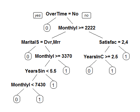
The Variable which the Tree Splits uupon in the first level is ‘OverTime’, followed by ‘MonthlyIncome’, indicating these are the most important variables.
Accuracy of the model on testing data set
PredictCART = predict(Tree, newdata = test, type = “class”)
table(test$Attrition, PredictCART)
## PredictCART
## 0 1
## 0 358 12
## 1 51 20
(358+20)/nrow(test) #Accuracy ~ 86%
## [1] 0.8571429
20/71 #Sensitivity ~ 28%
## [1] 0.2816901
AUC of the model
library(ROCR)
predictTestCART = predict(Tree, newdata = test)
predictTestCART = predictTestCART[,2]
#Compute the AUC:
ROCRCART = prediction(predictTestCART, test$Attrition)
as.numeric(performance(ROCRCART, “auc”)@y.values)
## [1] 0.7009326
Interpretation
We see that even though CART model beats the Baseline method, it underperforms the Logistic Regression model. This highlights a very regular phenomenon when comparing CART and logistic regression. CART often performs a little worse than logistic regression in out-of-sample accuracy. However, as is the case here, the CART model is often much simpler to describe and understand.
Random Forest Model
Finally, let’s try build a Random Forest Model.
library(randomForest)
## randomForest 4.6-12
## Type rfNews() to see new features/changes/bug fixes.
set.seed(100)
rf = randomForest(Attrition ~ ., data=train)
#make predictions
predictRF = predict(rf, newdata=test)
table(test$Attrition, predictRF)
## predictRF
## 0 1
## 0 366 4
## 1 57 14
380/nrow(test) #Accuracy ~ 86%
## [1] 0.861678
14/71 #Sensitivity ~ 19.7%
## [1] 0.1971831
The accuracy is better than the CART Model but lower than the Logistic Regression Model.
Understanding Important Variables in Random Forest Model
One way of understanding this is to look at he number of times, aggregated over all of the trees in the random forest model,that a certain variable is selected for a split. This can be done using the following code:
#Method 1
vu = varUsed(rf, count=TRUE)
vusorted = sort(vu, decreasing = FALSE, index.return = TRUE)
dotchart(vusorted$x, names(rf$forest$xlevels[vusorted$ix]))
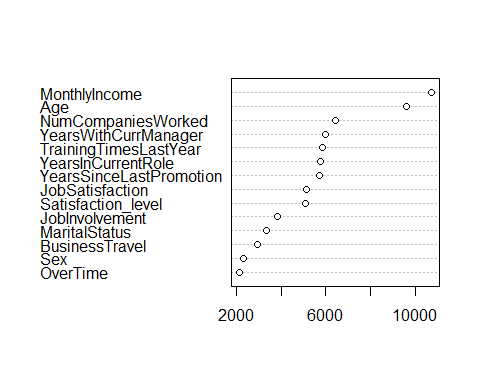
We can see that MonthlyIncome and Age Variables are used significantly more than the other variables.
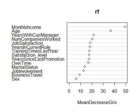
Method 2
A different metric we can look at is related to “impurity”, which measures how homogenous each bucket or leaf of the tree is. To compute this metric, run the following command in R
varImpPlot(rf)
Conclusion – The Advantage of Analytics
In the absence of predictive modeling, we would have taken the naïve approach of predicting the majority of outcomes as the predictions which would have meant we would have labeled all employees as ‘Non Churner’. This would have defeated the entire purpose of controlling employee churn. Using various predictive modeling techniques, the organization is not just able to conveniently beat the baseline model but also predict with increased accuracy which employees have higher probability of leaving the organization.
Action Plan
Finally the organisation can look at the predictions and score the employees basis their probability of leaving the organization and accordingly,develop retention strategies.
End Notes
Please note that this is an introduction to HR Analytics using Predictive modeling. There are various other techniques which can be used to carry out this exercise,which was beyond the scope of this article. Also, even the models which have been constructed could have been improved by fine tuning various parameters. However, these have been not considered to keep the explanation simpler and non-technical.
Author: Vikash Singh
Profile: Seasoned Decision Scientist with over 11 years of experience in Data Science, Business Analytics, Business Strategy & Planning.


vikash-analytics1 Posts


5 Comments
Leading HR Execs Discusses How Big Data Can Help You Hire Smarter - Fusion Analytics World
October 18, 2016 at 6:20 am[…] major challenge initially was overcoming the lack of analytical skills within HR. This is consistent with the findings of a joint Harvard Business Review and Visier study, which […]
Eloisa
April 15, 2017 at 3:12 amPretty! This has been a really wonderful post. Thank you for providing this info.
Andrew Stokes
April 23, 2017 at 6:29 amI might not concur with whatever you authored right here.
I have a different perspective and to my thoughts it’s a lot more intensifying!
I think that HR Analytics: Understanding & Controlling Employee Attrition using
Predictive Modeling is the topic which is very interesting,
but we should look at it from different angles!
Rajesh Shaw
April 25, 2017 at 2:37 pmI love the number of troubles in our modern training method are displayed listed here!
I’m students myself and I know from very own practical experience about some problems that are described listed.
Atul Bhandari
February 2, 2018 at 2:53 pmWonderful goods from you, man. I’ve understand your stuff previous
to and you’re just too great. I really like what
you have acquired here, really like what you’re saying and the way
in which you say it. You make it enjoyable and you still care
for to keep it smart. I can not wait to read far more from you.
This is really a wonderful site.