Why we love these 5 data visualization tools
If you are from the finance, sales, marketing or operations sector, then you must have noticed that massive data is crawling into your everyday life. No doubt it will keep growing with a good reason. The only problem is how you get results out of the data before making any kind of decisions.
For example, if you are having terabytes of data, what is the first thing will you do to retrieve some information? You will try to build a graph or chart, right? If you are the decision maker, you will probably think about how data visualization tools can help you analyze your data? It is because visualization is the only good option to understand large data sets. Data visualization tools deliver a graphical layer on top of the data set. These tools are very helpful if you have completed your data analysis and want to translate that analysis into pixels. A specialized set of data visualization tools can help you build much more advanced visualizations.
Here, you will find detailed explanation of tools, their features and most importantly their visual effects, so you will get better idea how business people generally interact with their data.
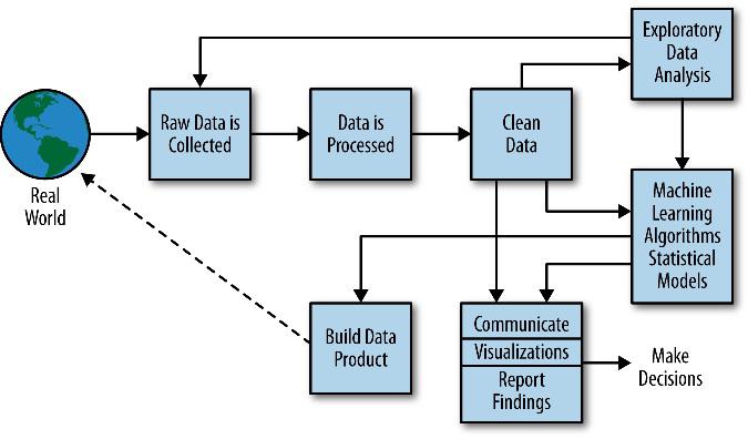 Image Source: http://www.craigperler.com/
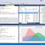
Before jumping to visualization tools, let’s understand the data science process that you should follow while analyzing your data.
After following the above given process you should start looking for the tool that can give you the best visualization of your data. Let’s move on to the visualization tools.
Tableau
Tableau is a very effective tool to create interactive data visualizations very quickly. It is very simple and user-friendly, and can be used by anyone as this tool is designed to be used by developer as well as non-developers. You can also embed the visualizations on your website.
Key Features:
- Connect with different data sources.
- Customizable views and dashboards.
- Calculations.
- Actions and filters.
- Maps and geocoding.
- Formatting and display.
- Publishing and sharing.
- Statistical calculation.
- Automatic scheduled reporting.
- Desktop application but completed graphics are stored on a public server.
- Store up to 50mb of data (with free plan).
- Graphic benchmark tools.
- Multiple languages.
- Drag-and-drop interface; no programming skills required.
Cost:
- Public edition – Free
- Tableau Personal edition – US$ 999.00
- Tableau professional edition – US$ 1,999.00
D3.js
D3. JS is a JavaScript library that is used for data visualization. To convert unstructured data collected from sources like government sources, social networking, eCommerce portals, etc. into some usable form or some sort of productive or understandable form, D3.JS is a very convenient tool. This JavaScript library is mainly used for creating data visualizations by highlighting web standards using CSS, SVG, and HTML, all with the full capabilities of latest browsers and no limitations of proprietary frameworks.
Features:
- D3.JS is reusable.
- Bind arbitrary data to DOM.
- Creates interactive SVG bar charts.
- Generates HTML tables from data sets.
- Variety of components and plugins to enhance abilities.
- Built-in reusable components for ease of coding.
- An open source project on GitHub. So, you can configure it and make some changes according to the need of your project functionality.
- Can be easily composed by simple and base functions of JavaScript, easier for a person having knowledge of HTML, CSS and JavaScript.
- Flexible according to your project requirement.
- Extensible, repeatable, easy to use and interactive.
Power BI
Power BI allows developers to create visualizations and display data in a very accurate way that you will not find such facilities in other BI tools. It can be done with minimal efforts and using existing skills. The Power BI Desktop has a large variety of standard visualizations that include a range of reports that people usually needs. These illustrations can essentially be created through Power BI Desktop or the Power BI products. Though, there are always those conditions where a diverse style of graphs, charts or tables are required to get a specific desired result. These types of customizations can be developed internally or developer can retrieve other customized visuals from the Visualization Gallery.
Key Features:
- The Custom Visual Gallery provides additional visualizations in Power BI
- Motivates users through the Power BI development community.
- With this tool users can schedule times for Power BI to reach to various data sources.
- Enables users to load and manipulate Power BI projects on tablets.
- It is a combination of multiple data visualizations in a single interface that offers an easy way to measure key performance indicators, whether tied to internal or external data sources.
- Power BI includes fill maps, combo charts, tree maps, gauges, and funnel charts.
- Power BI Designer lets users import and model data and author and publishes Power BI reports without Excel.
- Users can use the cloud-based Power BI service without moving data from Microsoft SQL Server instances into the cloud.
- Users can explore their data using simple questions and get answers in the form of interactive graphs or charts.
R
R is a language and an environment to run statistical calculations and produce data graphics. According to Google Trends, R is a language and tool very much related with creating data visualizations. It offers a variety of plotting devices where some of them are whole systems that a person needs to learn like a new language. Let’s walk through the more detailed explanation of this language.
This is a programming language for statisticians and data analyst working out with small datasets but now R has better support for big data analytics owing to the recent tie up with Microsoft.
One great element of R programming is its Reproducible Research. Data scientists write code that will extract the data and analyze it and generate a HTML, PDF or a PPT for reporting. In case any third party is interested, the original author can share the code and data to the interested third party who can trace it back to reproduce the same results. It is possible by using Knitr and R Markdown package.
For the visualization, the most important libraries and packages are caret, ggvis, ggplot2, zoo, stringr, plyr, dplyr, reshape2, shiny.
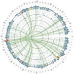
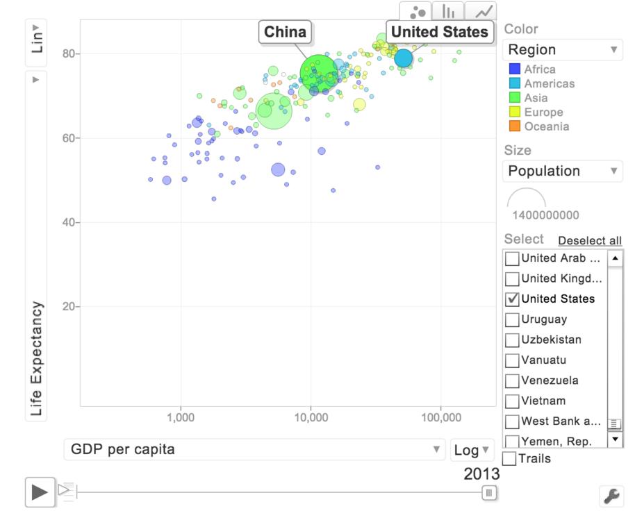 (Image Description: Gap minder Data Visualization using GoogleVis and R)
Key Features:
- It’s free, open source, and available on every major platform.
- Deep-seated language support for data analysis.
- This also includes features likes missing values, data frames, and sub setting.
- Offers huge set of options for visualization, statistical modelling, and importing or manipulating data and machine learning.
- Considered as a powerful tools for communicating with results.
- It is easier to produce html or pdf reports, or create interactive websites.
- R is not just a programming language; it is also an environment for interactive data analysis.
- It has powerful Meta programming facilities.
- With R programming, data scientists can draw meaningful insights from data in various dimensions by using 3D surfaces and multi-panel charts.
- R language is designed particularly for data analysis with a flexibility to mix and match different statistical and predictive models for best possible outcomes.
Python
Python is an extensively used high-level programming language for general purpose. Its design highlights code readability and its syntax allows analyst to express concepts in fewer lines of code that would be possible in languages such as C++ or Java.
Data scientists make art in form of digital visualization (of data) with a motive of establishing the hidden patterns/insights in it. There are multiple options for creating visualizations in data science. Let’s see various visualization charts using Python.
Matplotlib: Matplotlib is one of the stablest, richest, most popular, open-source plotting libraries for Python. It is tightly integrated with the PyData stack and works seamlessly with Pandas and NumPy data structures. It is useful in a variety of applications and use cases. It offers the highest level of customizability, which makes it easy to create complex plots and visualizations. These can be embedded into applications made with Python and Qt.
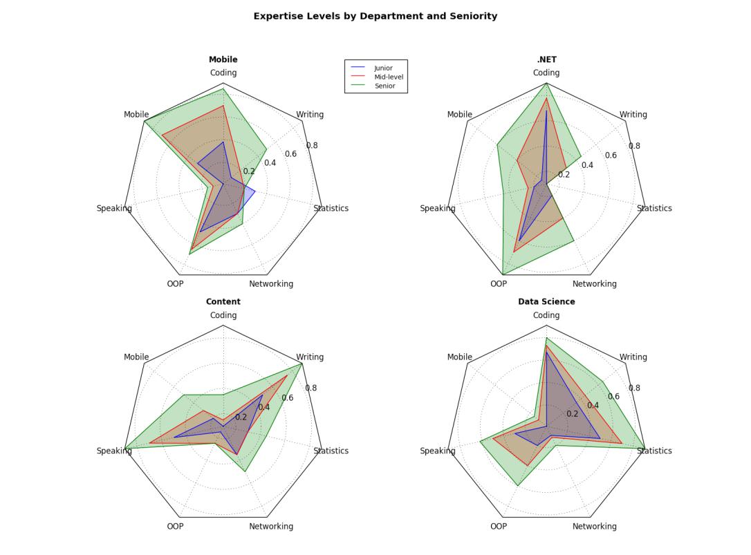 (Image Description: This chart indicates expertise levels by department and seniority. )
Key features:
- High customizability.
- Most common and advanced charts supported out of the box (including the common ones such as bar, line, pie, scatter etc. and advanced one such as violin, box, heat map, polar, stream plots, and so on).
- Virtually any chart can be created.
- Multiple plots and subplots.
- 50+ built-in color maps and schemes.
- Native SVG support.
- Date handling.
- 3D plots also supported using mplot3d toolkit.
- Support for dynamic charts through widgets such as slider, button, etc.
- Can be embedded into applications using different back-ends.
- Stable and actively maintained.
- Great community support.
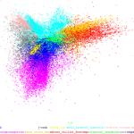
Seaborn: It is another open-source plotting library that emphasizes on aesthetics and ease of use. It couples matplotlib with some exploratory statistical analysis functionality from scipy and statsmodels libraries.
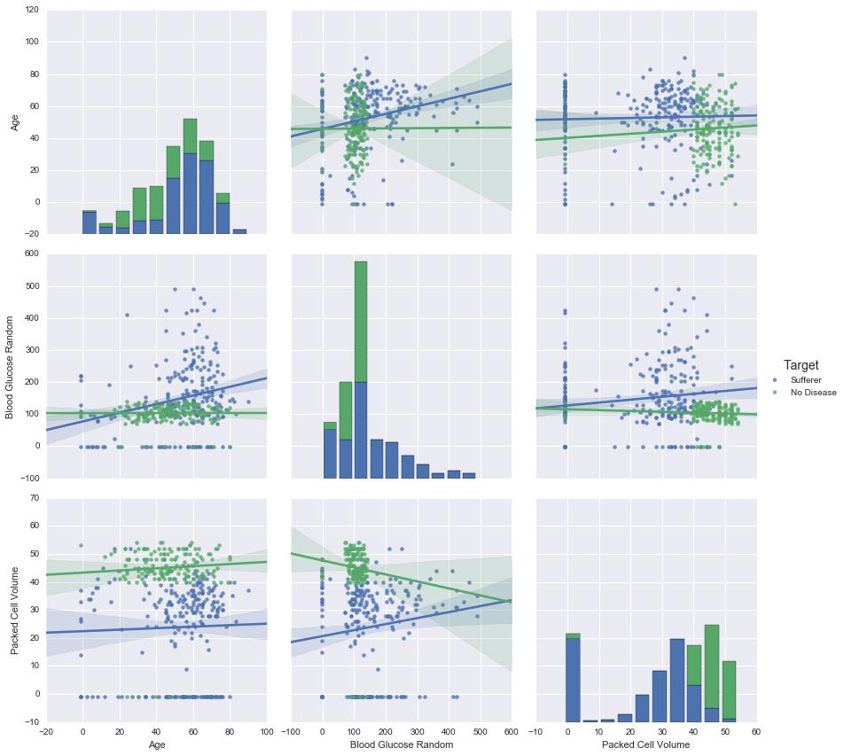 (Image Description: “This chart indicates inter-variable relationships in the data. The scatter plot is colored by our variable of interest, which indicates whether the person is a sufferer of CKD or has no disease. This kind of plot helps visualize the separability of classes.”)
Key features:
- Options for color palettes to make creative plots that reveal patterns of the data.
- It visualizes linear regression models for different kinds of independent and dependent variables.
- Also visualize matrices of data and use clustering algorithms to discover structure in those matrices.
- High-level abstractions for structuring grids of plots that lets user easily build complex visualizations.
Bokeh: It is an interactive visualization library for Python that targets modern web browsers. Its main goal is to provide high-quality, modern and novel graphics in the vein of D3.js and to seamlessly support interactivity over large, distributed, or streaming data sets.
Key features:
- The biggest benefit of having Bokeh is that it merges the style, aesthetics, interactivity, customizability, and ease-of-use with the agility and familiarity of the Python language. Without having to rely on external languages and frameworks such as D3.js or jQuery, Python developers and data scientists who primarily use the PyData stack can create rich dashboards and visualizations within the comfort of a familiar ecosystem. Bokeh offers quick and effortless deployability to web and can be embedded in Flask and Django web apps.
- Bokeh is actively maintained by Continuum Analytics, which recently won $3 million in funding as part of the Defense Advanced Research Projects Agency (DARPA) XDATA program for Bokeh and Blaze. Continuum’s efforts on Blaze and Bokeh will help make big data processing and visualization more scalable, extensible, and interactive.
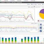
These specific types of data visualization tools allow users to dig high-level data in a single glance. Similar to the dashboard of the car allows people to monitor key metrics at a given point in time with indications on when to slow down, speed up, or refuel. There are many tools available in the market but we have chosen top 5 that shine when it comes to data visualization.
This article taken from http://smartdatacollective.com
27 comments
Profile Status
ACTIVE
Profile Info


Kalyan Banga226 Posts
I am Kalyan Banga, a Post Graduate in Business Analytics from Indian Institute of Management (IIM) Calcutta, a premier management institute, ranked best B-School in Asia in FT Masters management global rankings. I have spent 14 years in field of Research & Analytics.


4 Comments
Kursus Pemrograman
September 30, 2016 at 10:58 amHello just wanted to give you a quick heads up and let you know a few of the
images aren’t loading correctly. I’m not sure why but I think its a linking issue.
I’ve tried it in two different browsers and both show the
same outcome.
admin
September 30, 2016 at 5:25 pmThank you Kursus for pointing it out. Will look into it at the earliest
5 Simple Steps To Create Story Driven Data Visualization - Fusion Analytics World
November 3, 2016 at 9:41 am[…] on the data you want to present, you’ll want to choose the visualization formats that can best communicate and illustrate your story. Here are four of the most common data […]
5 Outstanding Data Visualization Tools And Why People Use Them
May 17, 2018 at 11:32 am[…] Source: FusionAnalyticsWorld […]