Comparing Popular Data Visualizations Tools
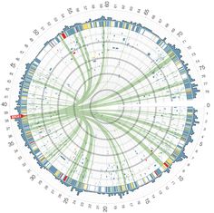
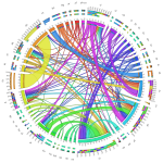
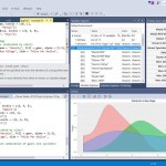
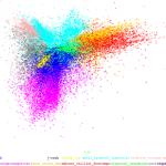
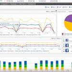
Here we ask you to identify which data visualization tool was used to produce the following 18 charts: 4 were done with R, 3 with SPSS, 5 with Excel, 2 with Tableau, 1 with Matlab, 1 with Python, 1 with SAS, and 1 with JavaScript.
How do you score? Would this be a good job interview question?
Chart 1

Chart 2

Chart 3

Chart 4

Chart 5

Chart 6

Chart 7

Chart 8

Chart 9

Chart 10

Chart 11

Chart 12

Chart 13

Chart 14

Chart 15

Chart 16

Chart 17

Chart 18

Author: Tim Matteson Source: Data Science Central
27 comments
Profile Status
ACTIVE
Profile Info


Kalyan Banga226 Posts
I am Kalyan Banga, a Post Graduate in Business Analytics from Indian Institute of Management (IIM) Calcutta, a premier management institute, ranked best B-School in Asia in FT Masters management global rankings. I have spent 14 years in field of Research & Analytics.


4 Comments
Atlas for Africa, a Free Data Visualization Platform - Fusion Analytics World
December 25, 2016 at 1:26 am[…] year, 65% of the MDG indicators for Central African countries were either estimated or came from data sources more than five years […]
FarmLogs Agriculture Analytics - Fusion Analytics World
December 25, 2016 at 4:17 am[…] not easy to use or integrate,” Vollmar said. “We’ve really been able to build new tools and make it clear how they can […]
Choosing a Business Intelligence Analytics Tool for Your Business Stats - Fusion Analytics World
February 12, 2017 at 6:28 am[…] the past four to five years, there has been a lot of buzz about big data and business intelligence software. But, if you don’t know what BI and its benefits are, you need […]
How can Data Science Program Give Just the Right Direction to Your Career? - Fusion Analytics World
April 9, 2018 at 12:27 pm[…] will be in charge of managing statistical information and turning it into meaningful form by using visualization and analytical tools. Moreover, you would play an essential role in decision making by generating […]